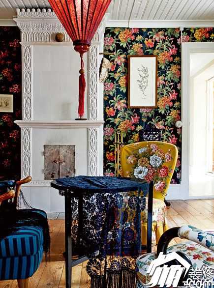
The basic principle of color application
The color of the entire material world is extremely rich, but no matter how complex and beautiful the color is, it is composed of red, yellow, blue, black, and black. Among them, red, yellow, and blue are the basic colors, and black and white are the adjustments. Color light and dark elements. Other colors can be constructed from the three basic colors. For example, red and yellow can be combined into orange, yellow and blue can be combined into green, and red and blue can be combined into purple. The combination of two basic colors is called the second time. Color (also known as inter-color), the color of the questioning is brighter.
The combination of the three primary colors is called the third color (also known as the complex color). The proportions of the three primary colors are different, and the combined colors are different. The color of this combination is fuller. If you add black color, you can change the purity of the color, so that the color becomes calm, if you add white, you can increase the brightness of the color, bright and translucent.
1. Color classification According to the influence of color on human psychology, colors are divided into warm and cold colors. The heat sources that humans contact in life, such as flames and sunlight, are dominated by red and yellow. Therefore, colors dominated by red and yellow are called warm colors. The warm colors reflect a warm, warm and cheerful atmosphere, which is mainly used in festive and warm environments. The colors of cool materials such as plants and sea are mainly blue and green. Therefore, the colors mainly composed of blue and green are called cool colors, which reflect a calm, moist, light atmosphere, and are mainly used in places where the mood needs calmness. .
2. The collocation of color says: "Red with green, Xu Wei crying" refers to the mismatch of colors in the same space, which makes people feel uncomfortable. Therefore, using multiple colors in the same space, It must pay attention to the changes in the color tone. In general, when various colors contrast very strongly, it is necessary to mix one color into each color so that each color contains that ingredient, thereby weakening the intensity of each color and achieving the purpose of enhancing the sense of harmony. In the color design of home decoration, more is the use of white tone to reduce the intensity of various colors, increase brightness, make the color of the entire space harmonious and natural.
3. The color transition In the home decoration, the colors that make up each side of the interior space cannot be exactly the same, so when one color plane is transformed into another color plane, you need to use the middle color to make transitions to avoid blunt color changes. It feels bad. For example, from the red floor to the light yellow wall, there should be skirts and skirtings with intermediate colors, so that the color can smoothly turn from red to light yellow. In the same façade, it is also necessary to make transitions in regions with intense contrasts. For example, when hanging a black-based photograph on a white wall, a purple or gray frame or decorative line transition is required. In the home decoration design, various The use of decorative lines mainly plays a role in color transition.
Villa Design Living Room Decoration Space Home Furnishing Lighting Furniture Living Room Wall Color Children's Bedroom Living Room Sofa Renovation Living Room Decoration Style Children's Bed Black Floor Cloth Sofa Seat Children's Sofa Cloth Sofa Fabric Bed Cloth Sofa Kitchen Cabinet Door White Furniture Floor Lamp Study Room Furniture Study Design Bathroom Design Restaurant Furniture Children's Restaurant Bedroom Lamps Bedroom Lamps Casual Restaurant
Special Purpose Sensor,Load Cell Multi-Axis,Load Cell Multi-Axis 20Kg,Two-Axis Load Cell Sensor
Zhejiang Nanhua Electronic Technology Co., Ltd , https://www.nhloadcell.com